
CoCreate Square
Brand
Guidelines
Everything the team needs to put CoCreate Square into the world: our story, our voice, the logo, colors, type and ready-to-use files.
Downloads aren’t available in this view. Open this guide in claude.ai to download logos and files.
This guide is a reference for our internal design team, marketing team, vendors and anyone authorised to work with the CoCreate Square brand. Our intent isn’t to restrict creativity and innovation, far from it. What we strive for is a coordinated, consistent and effective brand presence in everything we create. If we make something, we want people to know where it came from.
01.
Brandfoundation
Aboutthe brand
CoCreate Square is a boutique narrative and strategic communications consultancy. We work with mission-driven leaders and organisations building solutions to Africa’s most pressing challenges and reimagining its future.
We believe locally led, purposeful innovation is key to Africa’s growth and development, shared prosperity and more equitable futures. These solutions already exist, but many struggle to reach their growth potential due to a narrative deficit that influences how African innovation is perceived, valued and funded.
CoCreate Square exists to close that gap. We partner with African founders and innovators to translate big ideas into compelling narratives that communicate value, build trust, and connect solutions with the right people, markets and capital to enable sustainable growth and scale impact.
Our vision
A collective (re)imagination of Africa towards shared prosperity and equitable futures.
Our mission
Building narrative capital for African innovation to shift how it is perceived, valued and funded.
Our corevalues
Purposeful innovation
We care deeply about the people and communities our work ultimately serves. That commitment guides how we approach our work and partnerships, with empathy, integrity, and a genuine investment in helping meaningful ideas succeed.
Co-creation
We believe the best solutions are created with people, not for them. We encourage diversity of thought and voices because the people closest to a challenge often hold the insights needed to solve it.
Imaginative curiosity
We practise curiosity with purpose. We ask better questions, challenge assumptions, connect seemingly unrelated ideas, and follow evidence wherever it leads. Curiosity helps us uncover insights others overlook and design strategies grounded in reality rather than assumption.
Excellent craftsmanship
We believe excellence is built through rigour, intentionality, and continuous improvement. We hold ourselves to a high standard, sweat the details that matter, and take ownership of delivering work that creates lasting value.
Our guidingprinciples
Brandarchetype
The Griot (Sage + Creator)In many West African societies, the Griot was far more than a storyteller. They were the keeper of collective memory, the interpreter of meaning, and the trusted guide who helped communities understand who they were, where they had come from, and chart a path to their future.
That is the role we occupy. We do not bring meaning to Africa’s innovation ecosystem, we make it legible. We provide strategic guidance (sage) and harness our craft and storytelling (creator) to protect, uplift and advocate for Africa’s dreamers, changemakers and innovators.
Brand traits
Tone ofvoice
Our voice and messaging is intentionally clear, accessible and actionable.
AlwaysIn on it, not outside it (empathetic)
We are not ignorant of the risks and struggles innovators have to contend with. We speak from a place of warmth, shared understanding and experience (as Africans, peers and experts), and to create clarity.
Bold and optimistic
We name real pressures and real possibilities plainly, from a solutions-driven perspective.
Unafraid of whimsy
Injecting joy and playfulness to build connection without undercutting credibility.
Confident
We are bold and unapologetic about our work and the change we want to create.
02.
Visualidentity
Ourlogo
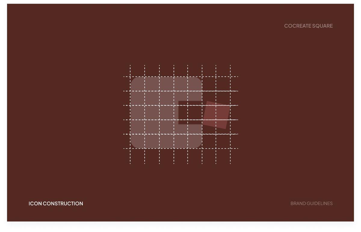
Use the brick logo on cream and light backgrounds, and the cream logo on brick or dark photography. Always use these files rather than recreating the logo.
Icon construction
Primarycolors
Brick is the brand’s grounding color: together with Cream, it’s the background for almost everything, from covers to posts to slides. Salmon is a highlight. Use it to draw attention to a word, a tag or a single block, and only rarely as a background.
Click any value to copy it.
Neutralcolor
Cream is the brand’s white. It doesn’t replace other colors; it replaces white. Wherever a design calls for white, whether a background, a logo or text on brick, use Cream. After Brick, it’s the main background color.
Secondarycolors
Sky blue, Teal, Gold and Orange are the brand’s accent colors, the offset pieces that break a primary field and give it energy. Use them in small blocks: a headline word, a tag, a single square breaking a larger field. Never as a full background on their own.
The one exception: Teal
Teal can fill a full background in the presentation template, or anywhere a template specifically says it’s allowed. Everywhere else, including other brand templates, keep it to small blocks like the other accents.
Balance at a glance
An illustration, not an exact formula: Brick and Cream carry the backgrounds, Salmon highlights, and the accents punctuate.
Supportingvisuals
The pattern is a puzzle. It comes directly from the mark itself, and it’s designed to hold things: text, a headline, a photograph, a quote.
The pattern isn’t a backdrop sitting behind the brand’s content, it’s the container the content sits inside, piece by piece. The grid layout is the basis of where the mosaic blocks are placed; it’s the secondary supporting element, mainly used on backgrounds as texture.
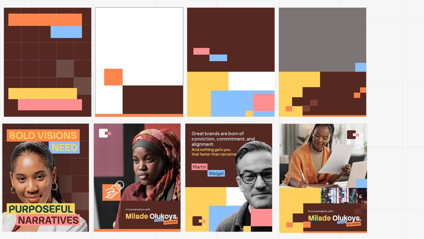
Pattern files
Primarytypefaces
Stack Sans Notch and Plus Jakarta Sans are the brand’s primary typefaces, one for saying things boldly, one for saying things clearly.
Stack Sans Notch
abcdefghijklmnopqrstuvwxyz
0123456789!”#$%&/()@=?,-
Blunt and confident, the voice of a brand that never asks permission. Bold and Medium for impact; Light for quieter, supporting moments.
Plus Jakarta Sans
abcdefghijklmnopqrstuvwxyz
0123456789!”#$%&/()@=?,-
Keeps long-form text comfortable, not decorative. Regular and Medium for running copy; Semi-Bold and Extra Bold for emphasis only, never headlines.
Secondarytypeface
Inter
abcdefghijklmnopqrstuvwxyz
1234567890!@#$%^&*
Inter is the brand’s secondary typeface: not a stylistic choice, a safeguard.
CoCreate Square’s work travels through platforms that don’t support custom fonts: Google Docs, Google Slides, email signatures, partner templates. Inter is the fallback that keeps the brand legible and consistent when Stack Sans Notch or Plus Jakarta Sans can’t render, a deliberate answer to the font-breakage problems that have already cost time on past projects.
Use it only where the primary typefaces are technically unavailable, never as a stylistic substitute where they could be used instead.
Try the type
Type hierarchy
- HeadingMain page titles. Stack Sans Notch, 64–300pt, line height 100%
- Own the story.
Build the strategy. - Sub-headlineStack Sans Notch, 45–54pt, line height 80%
- Your vision doesn’t need permission, just narrative.
- BodyPlus Jakarta Sans, 24–36pt, line spacing 120%
- At CoCreate Square, we don’t write your story for you. We help you finally own it.
- Call to actionStack Sans Notch, line spacing 100%
- Own it with CoCreate
Brandphotography
Photography should authentically reflect the people we serve: African founders, entrepreneurs, innovators, and business leaders.
Feature individuals who reflect our core audience, typically professionals and founders in their late 20s to 40s, building businesses, leading teams, collaborating, and solving meaningful problems. Portray African innovation through a lens of agency, excellence, ambition, and possibility, using authentic, high-quality photography that captures confidence, collaboration, and progress.
Prioritise
- Images that represent the diversity of Africa across gender, age, and context
- Intentional representation of women in leadership, innovation, and decision-making roles
- People building, leading, collaborating and solving problems
Avoid
- Stereotypical imagery
- Aid-driven or deficit-focused imagery
- Inauthentic or low-quality photography








03.
Brandapplication
The brandin use
Approved applications of the identity. Where a file exists, download it and start from it rather than rebuilding the layout.
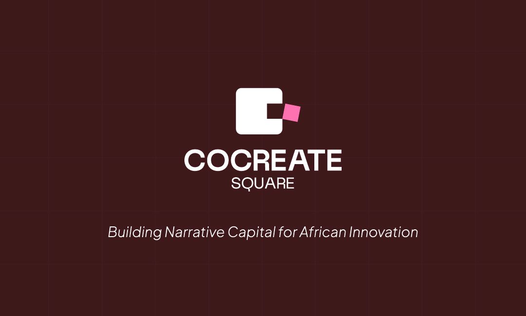
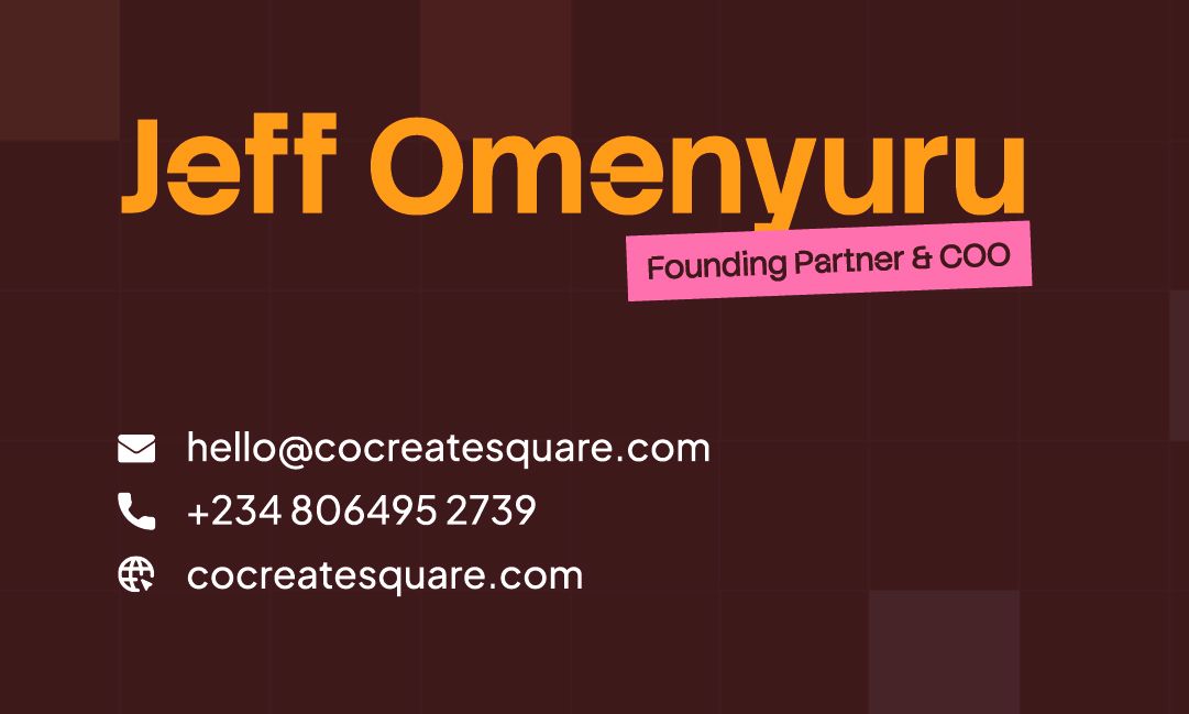
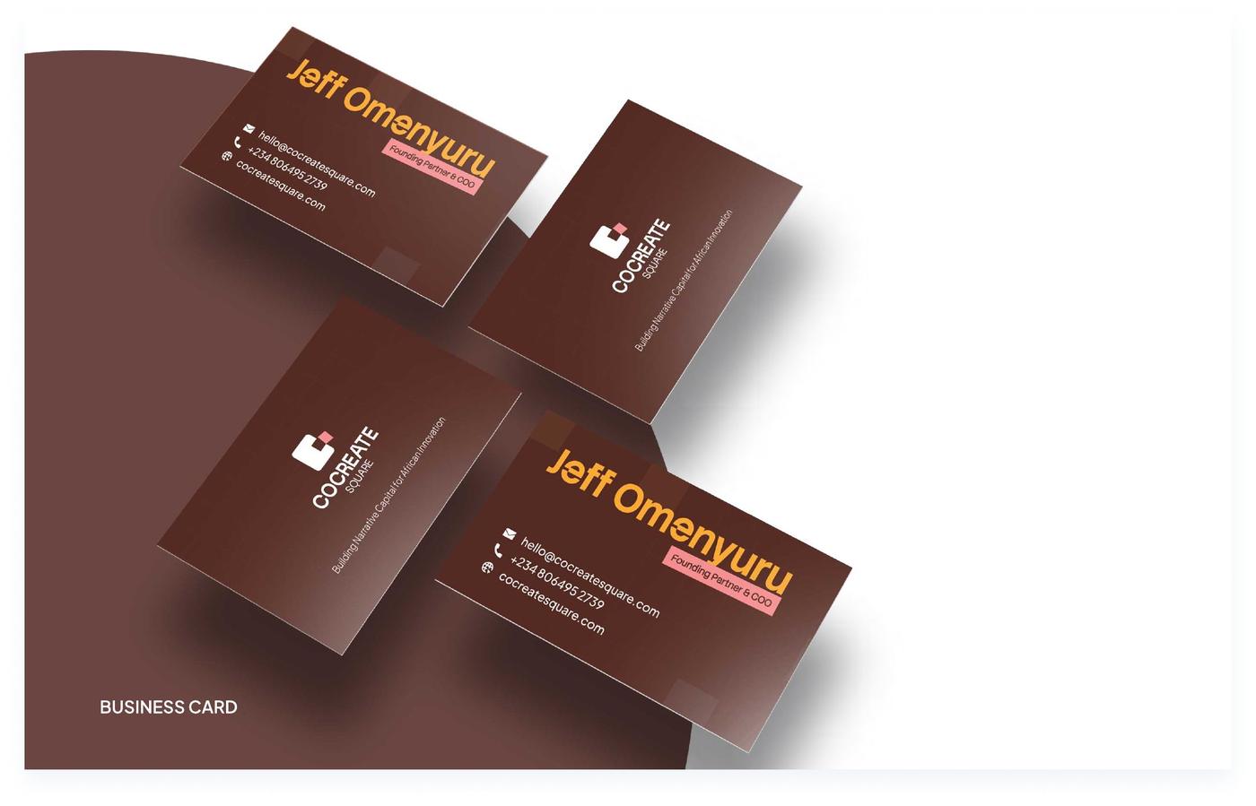
Business cards
3.5 × 2 in, print-ready with crop marks. One shared front, personalised backs.
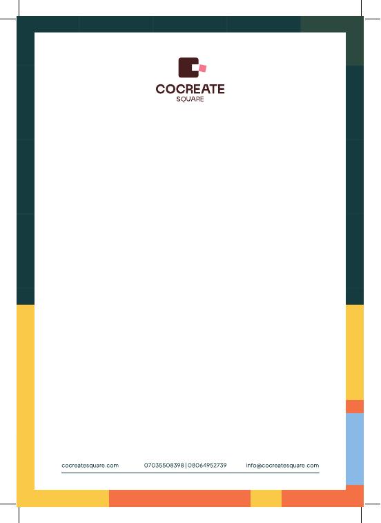
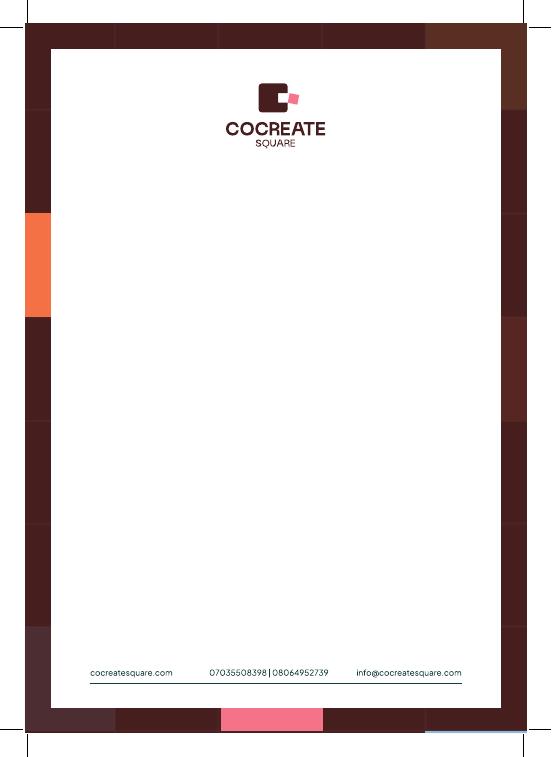
Letterhead
A4, two border options: teal and gold, or brick.
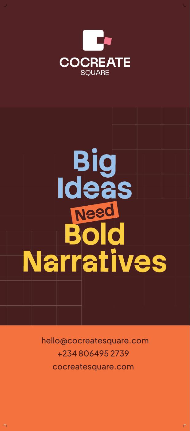
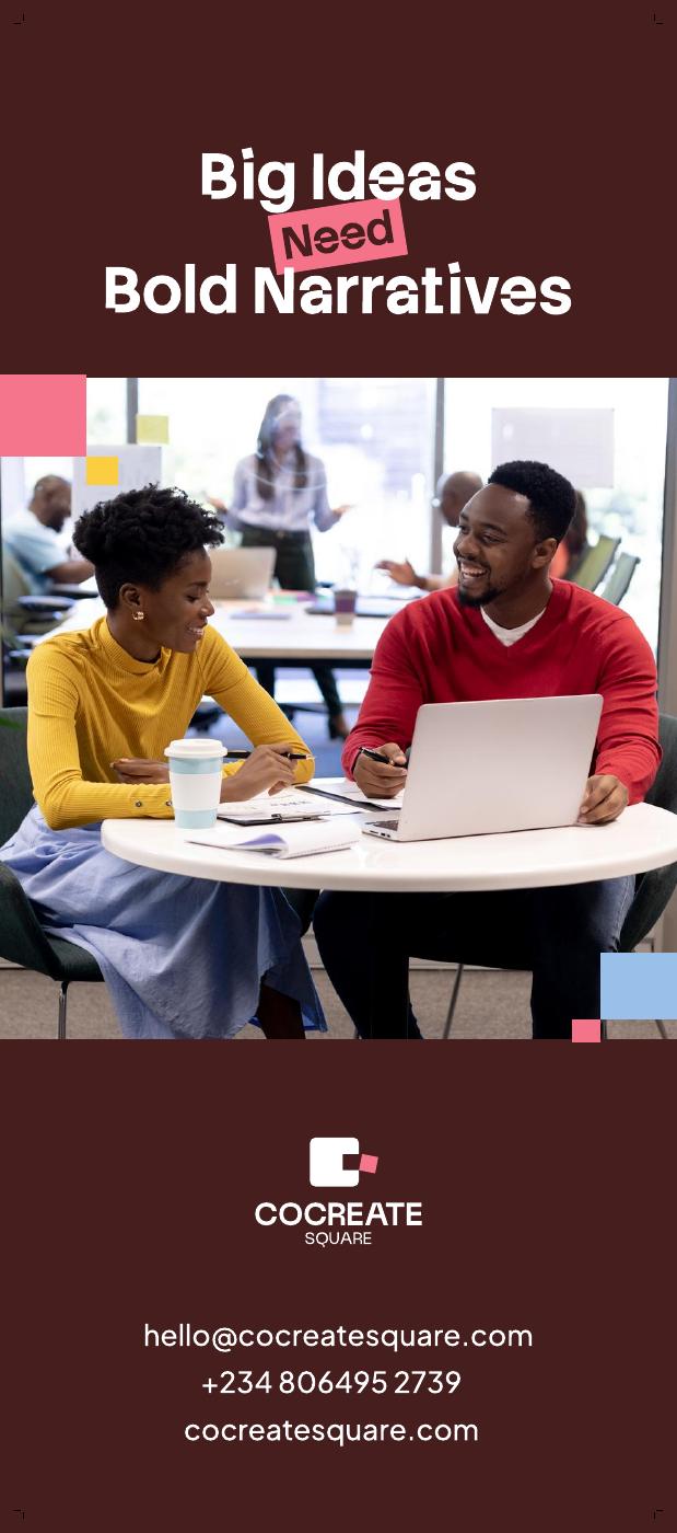
Roll-up banner
850 × 2000 mm, two designs.
Stickers
Vector files, ready for print.
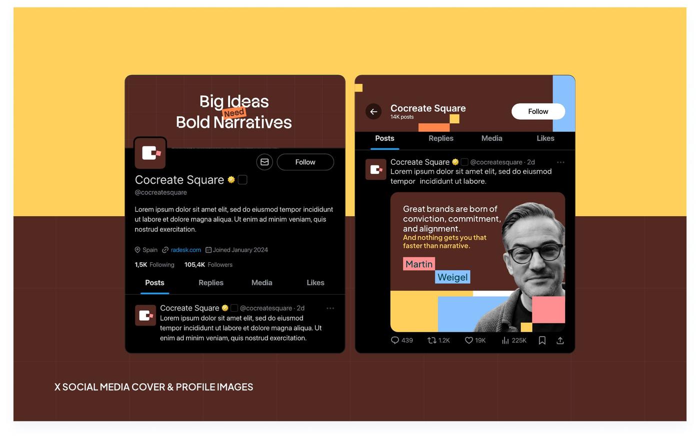
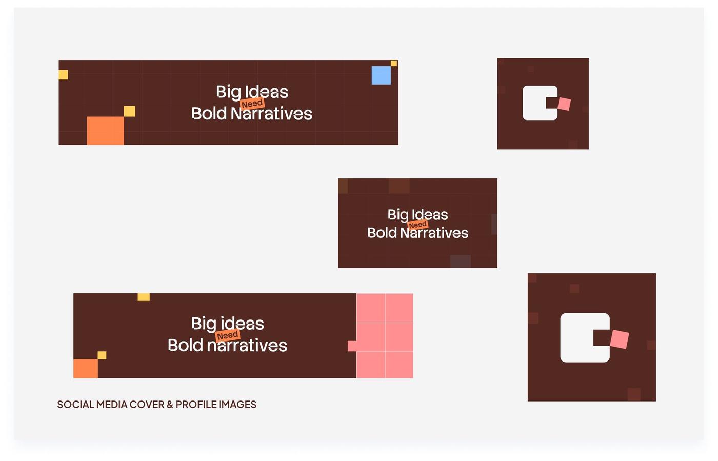
Social media
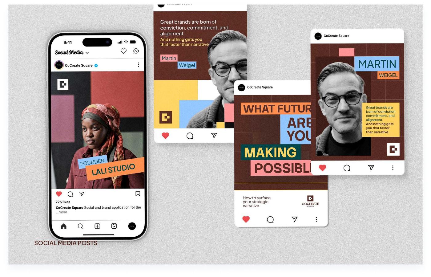
Profile and cover images, and post layouts. Post backgrounds are in Supporting visuals.
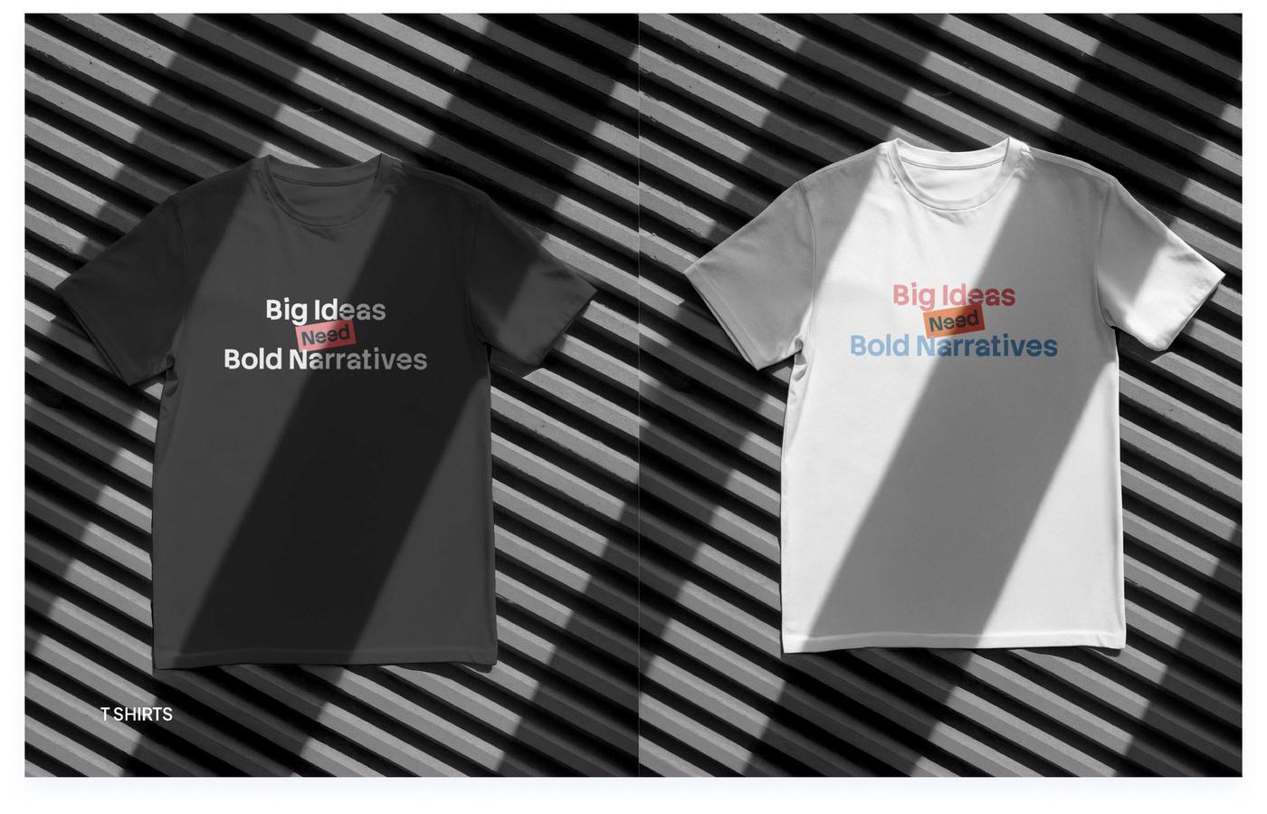
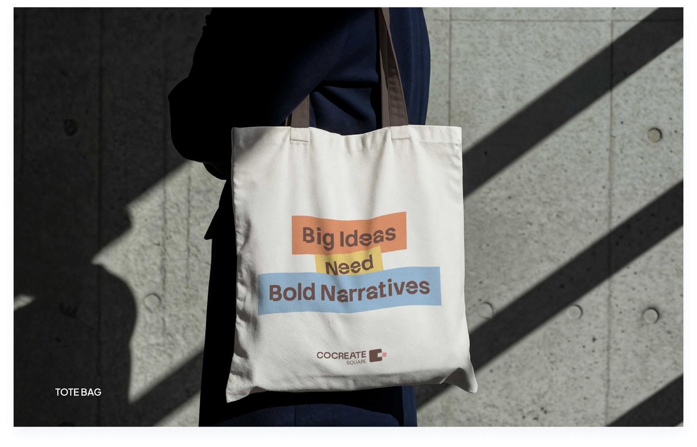
Merchandise
Presentation template
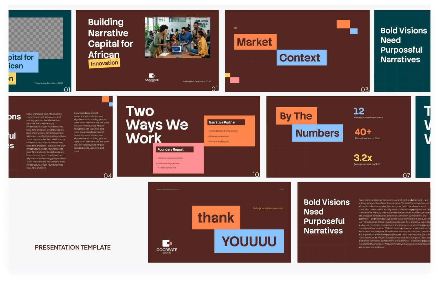
17 slides. In Google Slides, choose File, then Make a copy, before editing. The email signature has its own builder, just below.
Emailsignature
Fill in your details to create your signature from the approved template, then copy it into your email app.
Best regards,
The banner is showing as a preview. Add the banner image link so recipients see it too.
Add it in Gmail
- Click Copy signature.
- In Gmail, open Settings, then See all settings.
- Under Signature, create a new signature and paste.
- Scroll down and click Save changes.
Add it in Outlook
- Click Copy signature.
- Open Settings, then Mail (or Accounts), then Signatures.
- Create a new signature, paste, and save.
Add it in Apple Mail
- Click Copy signature.
- Open Mail, then Settings, then Signatures, and add a new one.
- Untick “Always match my default message font”, then paste.
Email apps can’t load the brand fonts, so the signature uses Inter with Arial as backup, exactly as the typography guidance asks.
Assetlibrary
Every downloadable file in one place.
Downloads aren’t available in this view. Open this guide in claude.ai to download files.